
Importance of Spacing
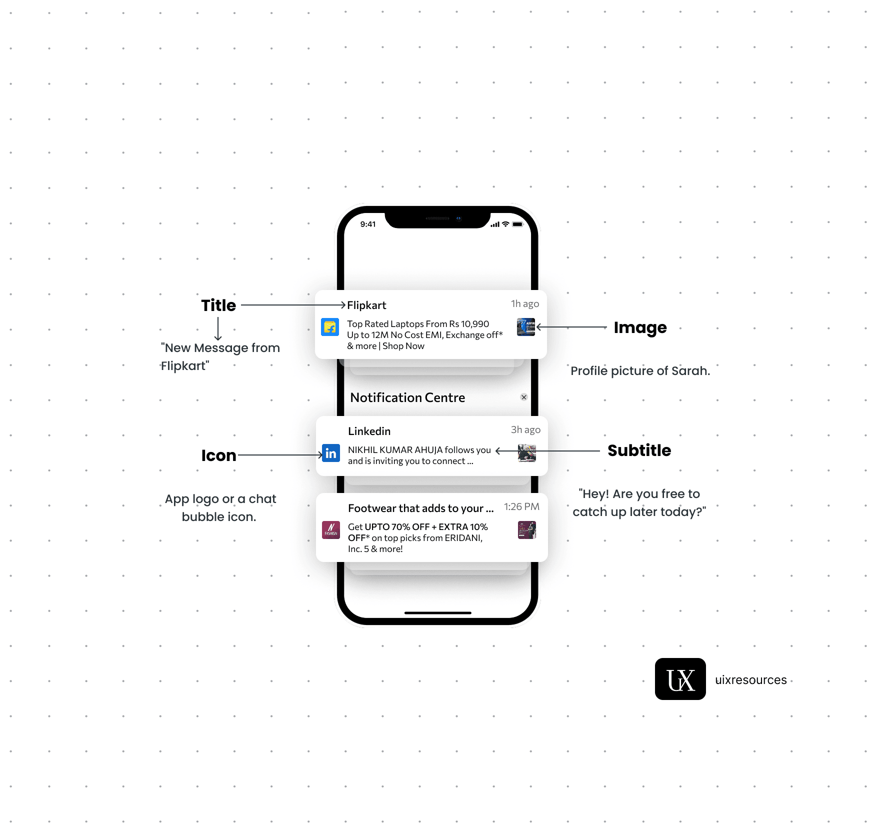
Notifications are critical components in UI design that provide users with timely information, updates, or alerts. They help keep users informed about changes, activities, or important events within an application, ensuring a responsive and engaging user experience.
Message Text:- Keep the message short, clear and to the point. It should convey the main information or call to action immediately.
Personalization:- Use the user's name or relevant personal data to make the notification feel more personal and engaging.
Actionable:- Include a clear call-to-action (CTA) that encourages user engagement, such as "Read More", "Reply" or "Shop Now"
Icons:- Use a recognizable app icon or a specific related to the notification to make it easily identifiable.
Image or Thumbnail:- Consider adding a small image or thumbnail to provide visual context and make the notification more engaging, especially for rich notifications.
Color:- Use brand colors and contrasting elements to make the notification stand out while aligning with your apps design.
Content and Clarity
Visual Elements
Content and Clarity:-
Message Text:- Keep the message short, clear and to the point. It should convey the main information or call to action immediately.
Personalization:- Use the user's name or relevant personal data to make the notification feel more personal and engaging.
Actionable:- Include a clear call-to-action (CTA) that encourages user engagement, such as "Read More", "Reply" or "Shop Now"
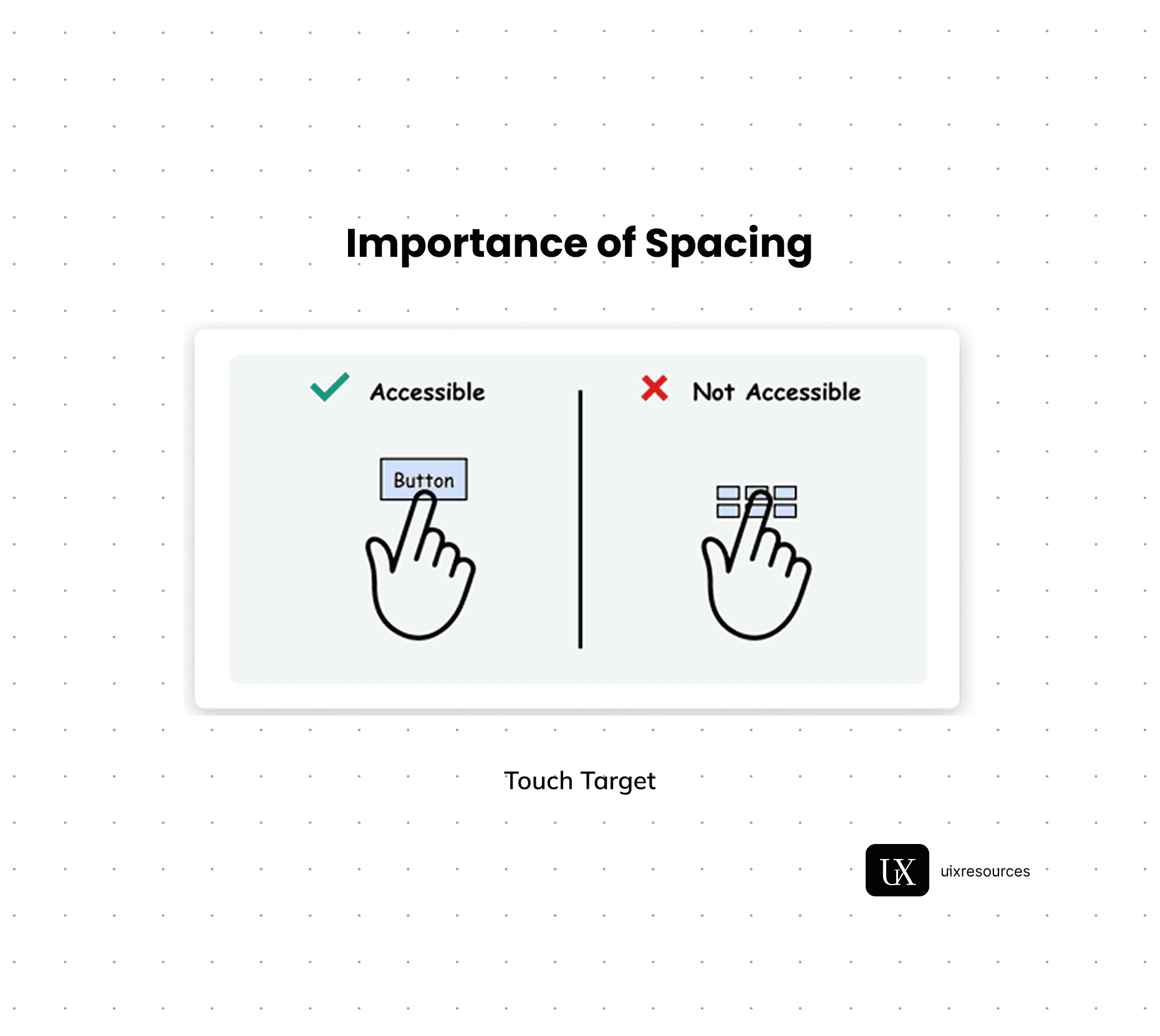
Spacing refers to the area between elements in a user interface, including margins, padding and gaps. Proper spacing is crucial for creating a visually appealing and functional design that enhances usability and user experience.
Spacing helps establish a clear visual hierarchy by guiding users attention to important elements. Adequate spacing can differentiate between primary and secondary actions, making it easier for users to navigate the interface.
Proper spacing between text line (line height) and paragraphs improves readability. It prevent text from feeling cramped and allows users to scan content more easily.
In mobile and web touch interfaces, sufficient spacing around buttons and interactive elements ensures that touch targets are easily tappable, reducing the likelihood of user errors.
Well- considered spacing contributes to a clean and organized layout, enhancing the overall aesthetic appeal of the design. It creates a sense of balance and harmony.
Visual Hierarchy
Readability
Touch Targets
Aesthetics
User Comfort
Adequate spacing reduces cognitive load by making the interface less cluttered. Users can focus on individual elements without feeling overwhelmed.
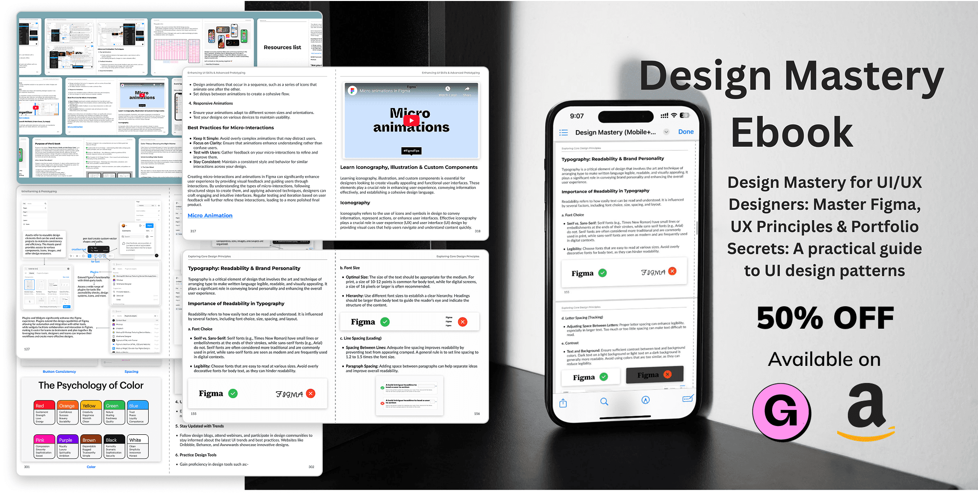
For in-depth learning, check out our e-book Design Mastery - your go-to guide for mastering UI/UX principles, real world breakdowns and expert insights.


Why Choose Us?
Expertly Designed Products
Time-Saving Solutions
Affordable Excellence
Reviews
This book explains UI/UX design in very practical and easy way. Must recommend for beginners. It will be game changer for you

Shreyansh
Amazon
Social Media