
Create Signup Account
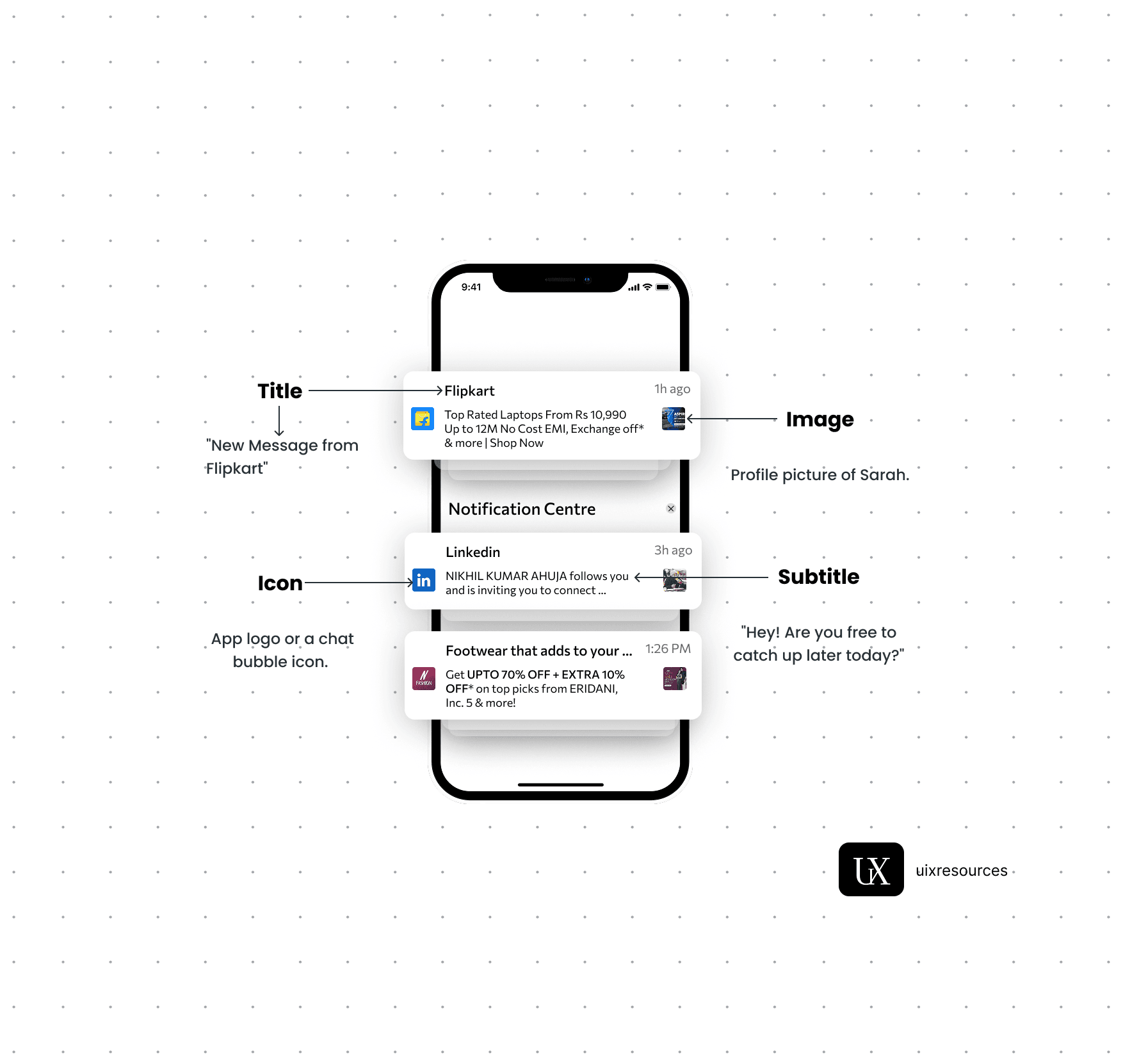
Notifications are critical components in UI design that provide users with timely information, updates, or alerts. They help keep users informed about changes, activities, or important events within an application, ensuring a responsive and engaging user experience.
Message Text:- Keep the message short, clear and to the point. It should convey the main information or call to action immediately.
Personalization:- Use the user's name or relevant personal data to make the notification feel more personal and engaging.
Actionable:- Include a clear call-to-action (CTA) that encourages user engagement, such as "Read More", "Reply" or "Shop Now"
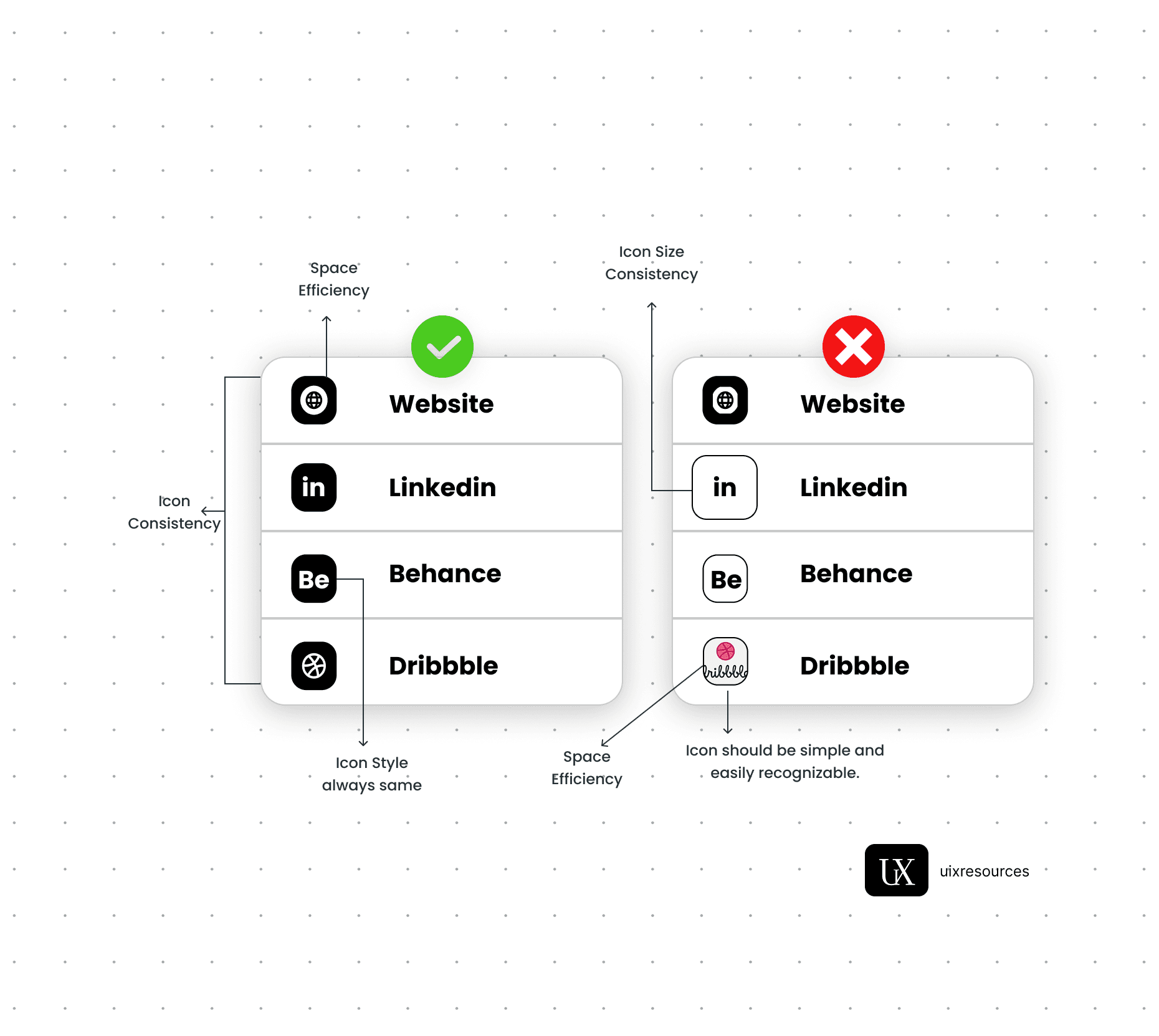
Icons:- Use a recognizable app icon or a specific related to the notification to make it easily identifiable.
Image or Thumbnail:- Consider adding a small image or thumbnail to provide visual context and make the notification more engaging, especially for rich notifications.
Color:- Use brand colors and contrasting elements to make the notification stand out while aligning with your apps design.
Content and Clarity
Visual Elements
Content and Clarity:-
Message Text:- Keep the message short, clear and to the point. It should convey the main information or call to action immediately.
Personalization:- Use the user's name or relevant personal data to make the notification feel more personal and engaging.
Actionable:- Include a clear call-to-action (CTA) that encourages user engagement, such as "Read More", "Reply" or "Shop Now"
The sign-up screen is often a user’s first real interaction with your product. A confusing or bloated form can increase drop-off rates and hurt your conversion. A smooth, clear, and user-friendly sign-up flow builds trust and gets users started faster.
Ask only for essential info (e.g., name, email, password).
Avoid overwhelming users with too many fields right away.
🧠 UX Principle: Hick’s Law – the more choices/inputs, the longer it takes to make a decision.
Provide sign-up with Google, Apple, or Facebook for quicker access.
Clearly separate social login from email sign-up to avoid confusion.
Labels should always be visible (avoid disappearing placeholders).
Use inline validation (e.g., “Invalid email format”) in real time.
Show Password Visibility Toggle

Keep It Minimal at First
Offer Social Sign-Up Options
Use Field Labels, Not Placeholder-Only
Make CTA Buttons Clear & Action-Oriented
Error Handling Should Be Clear and Kind
Use specific button labels like “Create Account” or “Sign Up Free” instead of just “Next.”
Use clear language (“Email already in use”) and helpful hints.
Highlight error fields without being harsh (avoid red overload).

Why Choose Us?
Expertly Designed Products
Time-Saving Solutions
Affordable Excellence
Reviews
This book explains UI/UX design in very practical and easy way. Must recommend for beginners. It will be game changer for you

Shreyansh
Amazon
Social Media