
Types of Cards in UI Design
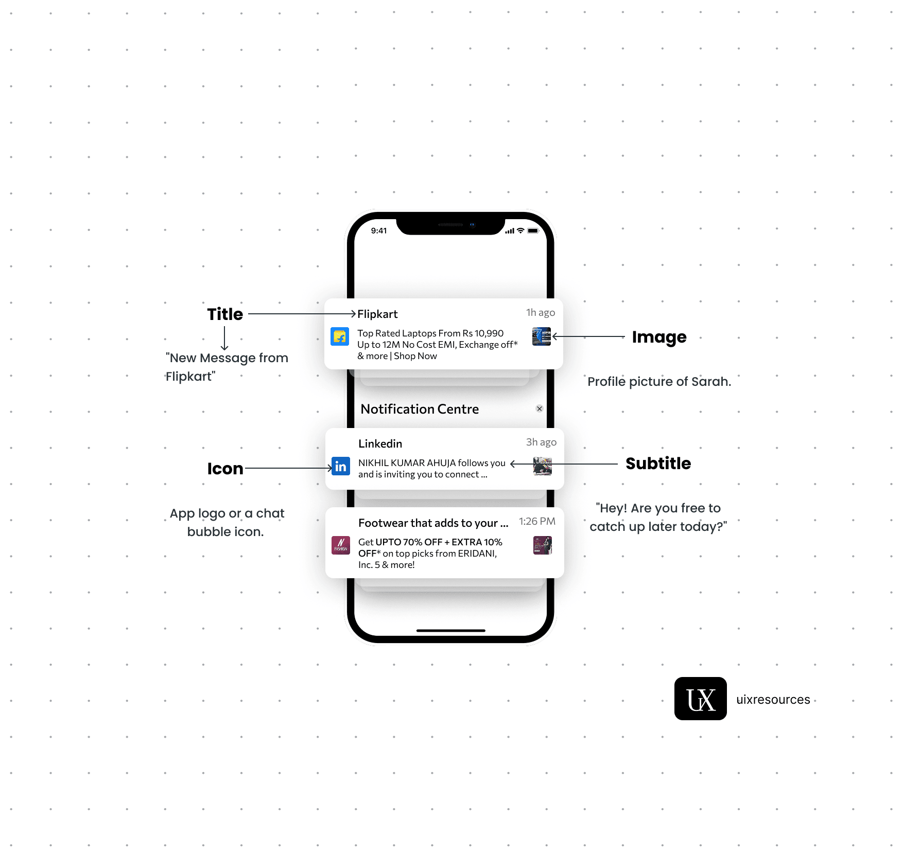
Notifications are critical components in UI design that provide users with timely information, updates, or alerts. They help keep users informed about changes, activities, or important events within an application, ensuring a responsive and engaging user experience.
Message Text:- Keep the message short, clear and to the point. It should convey the main information or call to action immediately.
Personalization:- Use the user's name or relevant personal data to make the notification feel more personal and engaging.
Actionable:- Include a clear call-to-action (CTA) that encourages user engagement, such as "Read More", "Reply" or "Shop Now"
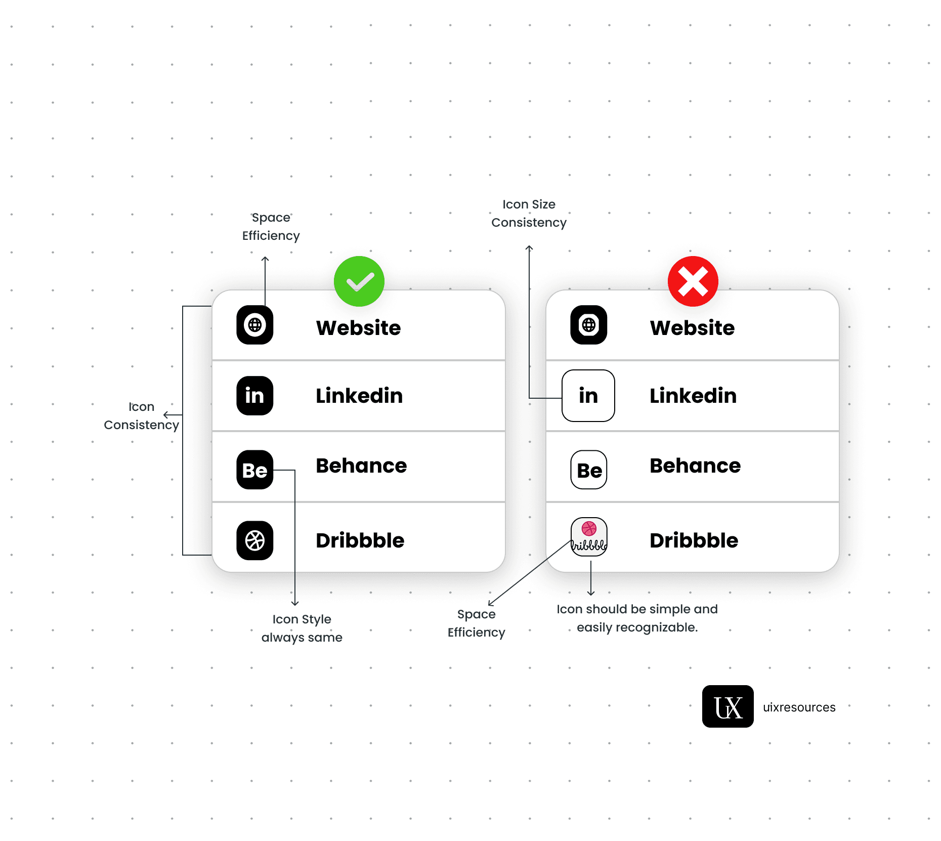
Icons:- Use a recognizable app icon or a specific related to the notification to make it easily identifiable.
Image or Thumbnail:- Consider adding a small image or thumbnail to provide visual context and make the notification more engaging, especially for rich notifications.
Color:- Use brand colors and contrasting elements to make the notification stand out while aligning with your apps design.
Content and Clarity
Visual Elements
Content and Clarity:-
Message Text:- Keep the message short, clear and to the point. It should convey the main information or call to action immediately.
Personalization:- Use the user's name or relevant personal data to make the notification feel more personal and engaging.
Actionable:- Include a clear call-to-action (CTA) that encourages user engagement, such as "Read More", "Reply" or "Shop Now"
Cards are versatile UI components used to display content and actions about a single subject. They act as containers that group related information, making it easier for users to scan, browse, and interact with content. Whether it's a news article, a user profile, a product, or a notification—cards provide a clean, modular way to organize and present data.
These cards contain text, images or multimedia and are often used for blog posts, articles or product descriptions.
Designing a notification card involves creating a visually distinct and functional elements that alerts users to important information or updates.
A product card is a compact visual representation of a product, featuring key elements like an image, title, price and call-to-action button.

Content Cards
Notification Cards
Product Cards
Profile Cards
Interactive Cards
Statistic Cards (Metric/KPI Cards)
Contain user information such as avatars, names and brief details, used in social media and team pages.
Include elements like buttons, sliders and forms allowing users to interact directly within the card.
Use: Display key performance indicators or quick stats.
Common in: Dashboards, analytics platforms.
Features: Metric label, number, icon/graph, trend indicator.
Example: Google Analytics or project dashboards.
Why Choose Us?
Expertly Designed Products
Time-Saving Solutions
Affordable Excellence
Reviews
This book explains UI/UX design in very practical and easy way. Must recommend for beginners. It will be game changer for you

Shreyansh
Amazon
Social Media