
Icons Consistency
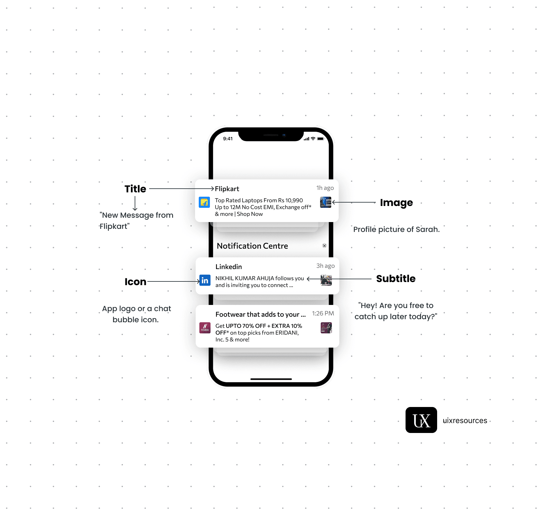
Notifications are critical components in UI design that provide users with timely information, updates, or alerts. They help keep users informed about changes, activities, or important events within an application, ensuring a responsive and engaging user experience.
Message Text:- Keep the message short, clear and to the point. It should convey the main information or call to action immediately.
Personalization:- Use the user's name or relevant personal data to make the notification feel more personal and engaging.
Actionable:- Include a clear call-to-action (CTA) that encourages user engagement, such as "Read More", "Reply" or "Shop Now"
Icons:- Use a recognizable app icon or a specific related to the notification to make it easily identifiable.
Image or Thumbnail:- Consider adding a small image or thumbnail to provide visual context and make the notification more engaging, especially for rich notifications.
Color:- Use brand colors and contrasting elements to make the notification stand out while aligning with your apps design.
Content and Clarity
Visual Elements
Content and Clarity:-
Message Text:- Keep the message short, clear and to the point. It should convey the main information or call to action immediately.
Personalization:- Use the user's name or relevant personal data to make the notification feel more personal and engaging.
Actionable:- Include a clear call-to-action (CTA) that encourages user engagement, such as "Read More", "Reply" or "Shop Now"
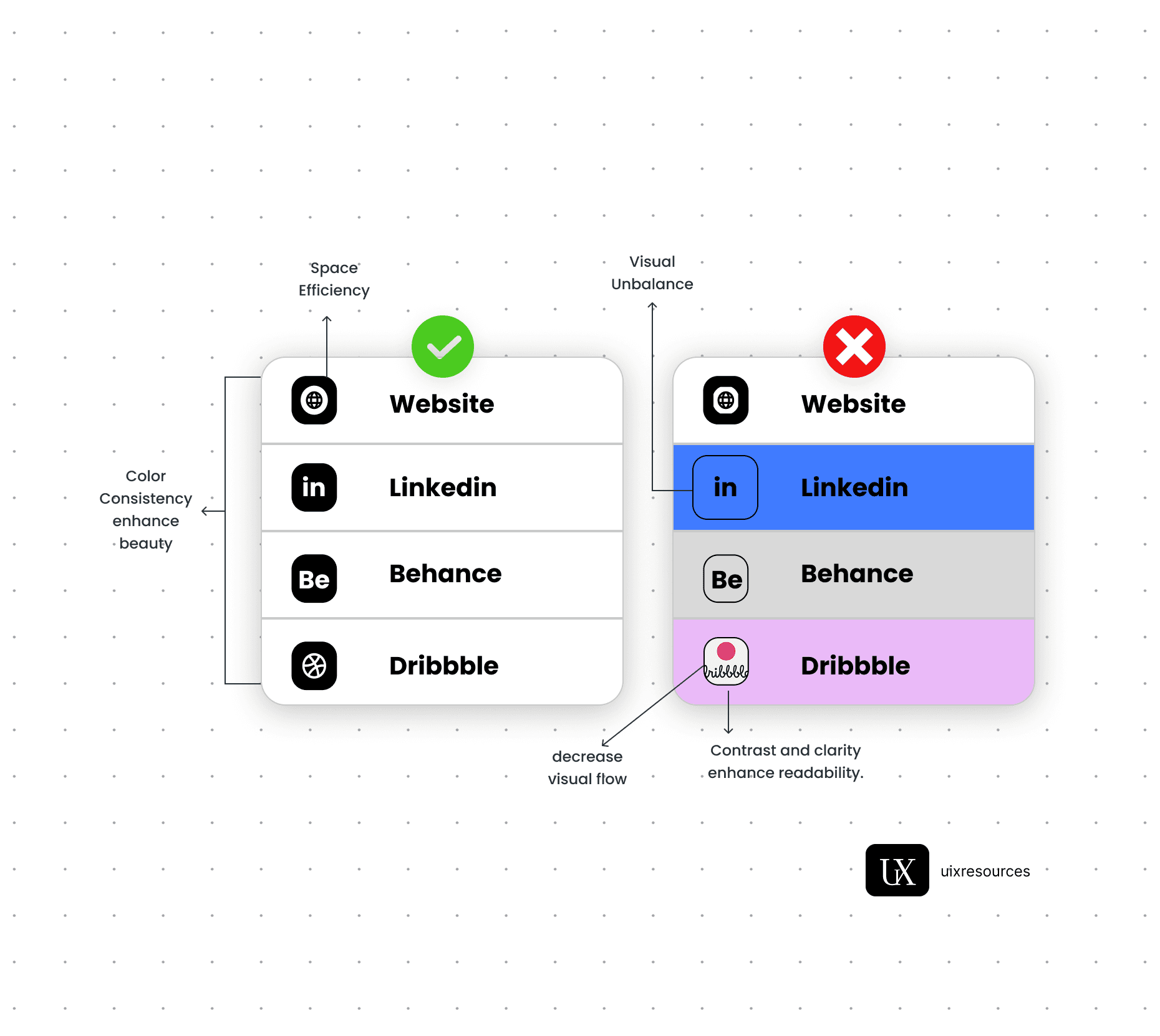
Icons are small but mighty—they visually communicate actions, statuses, and ideas at a glance. But when icon styles, sizes, or meanings vary across your product, they create confusion and reduce user trust. Consistent icon design ensures a smoother, more intuitive user experience, reinforcing your product's visual language.
Stick to one icon library (e.g., Material Icons, Font Awesome, Lucide) or a custom-designed set.
Avoid mixing styles like outlined, filled, two-tone, and hand-drawn in the same interface.
Use consistent stroke weight, corner radius, and padding.
Align icons properly with text and UI elements.
🔍 Icons with inconsistent padding or misaligned to buttons/text can break visual flow.
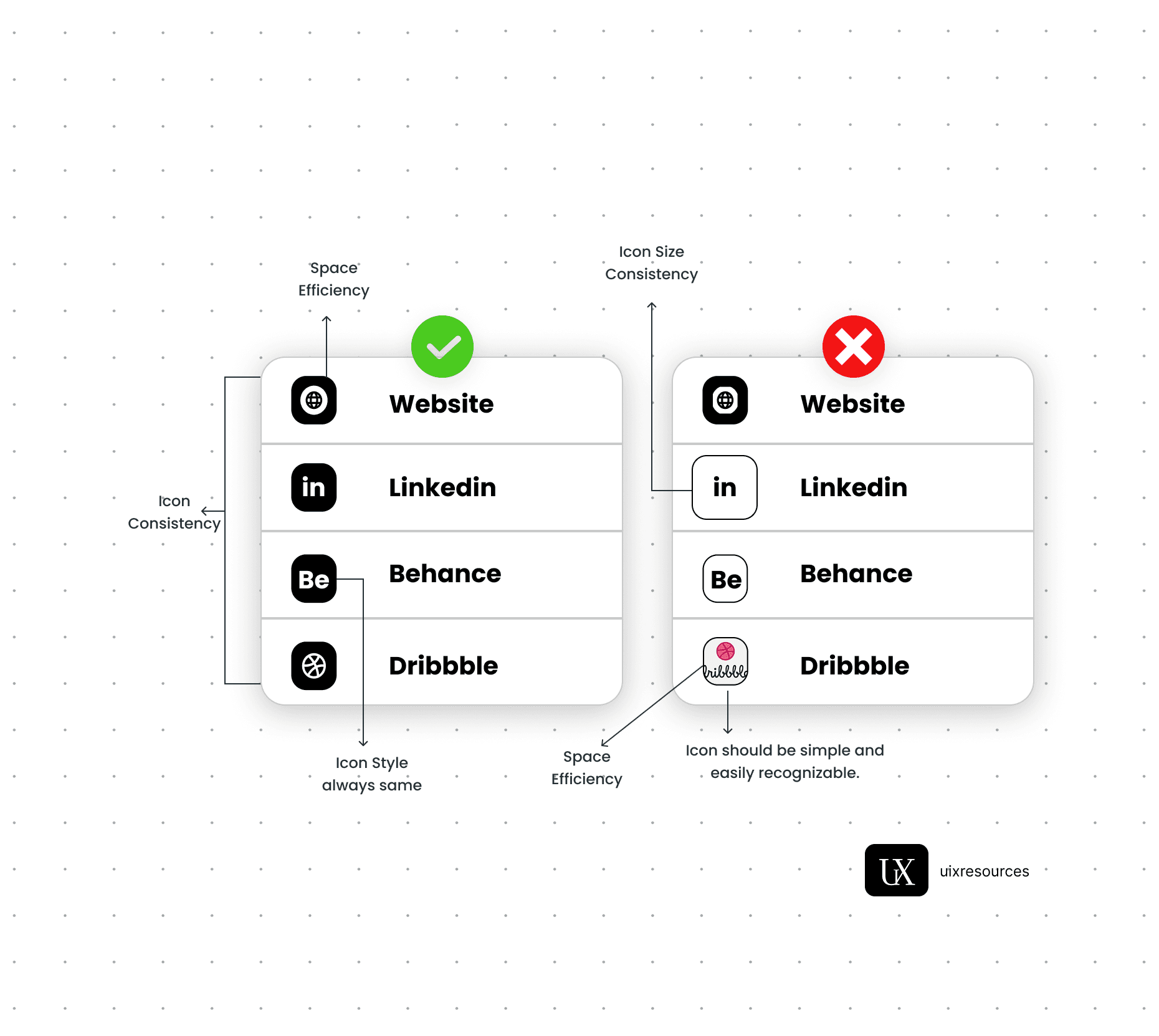
Use a Single Icon Set or Style Guide
Maintain Visual Rhythm
Assign One Meaning per Icon
Consistent Sizing Across Screens
Accessibility & Labeling
Never reuse the same icon for multiple actions (e.g., using a “+” for both “add” and “invite”).
And never assign multiple icons to the same action across different parts of your app.
Standardize icon sizes for touch targets (usually 24px to 48px).
Avoid scaling icons arbitrarily between screens/components unless functionally necessary.
Always pair icons with tooltips, labels, or alt text (especially if they perform important functions).
Don’t rely solely on icons to communicate action—some users may misinterpret the meaning.

Why Choose Us?
Expertly Designed Products
Time-Saving Solutions
Affordable Excellence
Reviews
This book explains UI/UX design in very practical and easy way. Must recommend for beginners. It will be game changer for you

Shreyansh
Amazon
Social Media