
Color Harmony
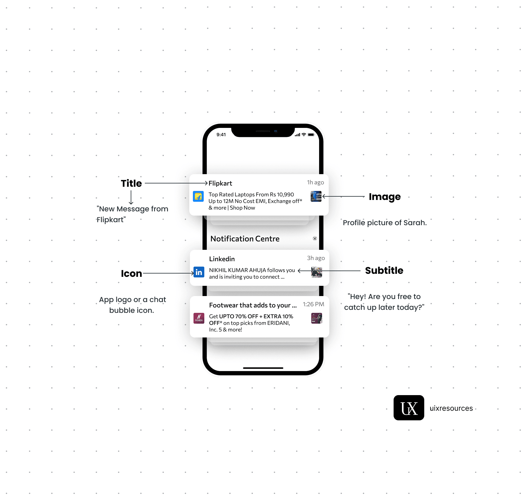
Notifications are critical components in UI design that provide users with timely information, updates, or alerts. They help keep users informed about changes, activities, or important events within an application, ensuring a responsive and engaging user experience.
Message Text:- Keep the message short, clear and to the point. It should convey the main information or call to action immediately.
Personalization:- Use the user's name or relevant personal data to make the notification feel more personal and engaging.
Actionable:- Include a clear call-to-action (CTA) that encourages user engagement, such as "Read More", "Reply" or "Shop Now"
Icons:- Use a recognizable app icon or a specific related to the notification to make it easily identifiable.
Image or Thumbnail:- Consider adding a small image or thumbnail to provide visual context and make the notification more engaging, especially for rich notifications.
Color:- Use brand colors and contrasting elements to make the notification stand out while aligning with your apps design.
Content and Clarity
Visual Elements
Content and Clarity:-
Message Text:- Keep the message short, clear and to the point. It should convey the main information or call to action immediately.
Personalization:- Use the user's name or relevant personal data to make the notification feel more personal and engaging.
Actionable:- Include a clear call-to-action (CTA) that encourages user engagement, such as "Read More", "Reply" or "Shop Now"
Color is one of the most powerful tools in UI design—it communicates mood, builds hierarchy, improves readability, and drives user actions. When used with harmony and consistency, colors create a visually cohesive experience that feels intentional and professional. Poor color choices, on the other hand, can confuse users, dilute brand identity, and reduce accessibility.
Use the same colors across screens for similar elements (e.g., buttons, alerts, links).
Create and follow a Design System or Style Guide.
Define color roles:-
Primary (e.g., main actions)
Secondary (e.g., alternative actions)
Error (e.g., red for danger)
Success (e.g., green for confirmation)
Info/Neutral (e.g., blue or gray for hints)
Reserve bright or saturated colors (like orange, yellow, red) for attention-grabbing actions like CTAs, alerts, or highlights.
Overusing them reduces their impact and can overwhelm the interface.
Ensure text has sufficient contrast against background (aim for 4.5:1 ratio for body text).
Use tools like Contrast Checker or Figma plugins like Able.
Don’t use color alone to convey information—always pair it with icons or text (e.g., a red error with an exclamation icon and message).
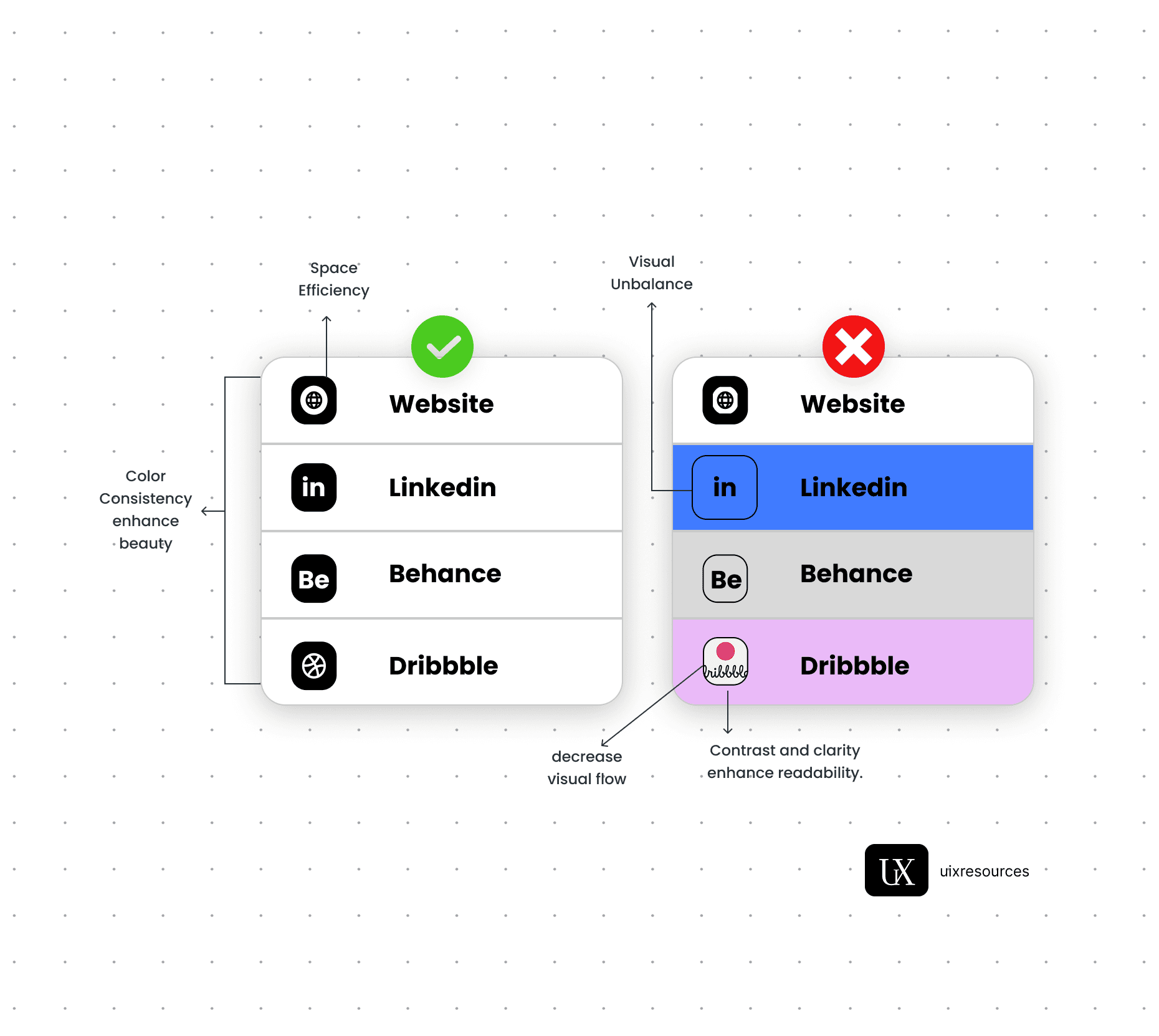
Ensure Color Consistency
Use Accent Colors Sparingly
Consider Accessibility (Contrast is Key!)
Adapt to Light & Dark Modes
Test your colors in both themes.
Avoid pure black/white—use soft variants (e.g., #121212 instead of #000000).
Ensure that the emotional tone stays consistent across modes.


Why Choose Us?
Expertly Designed Products
Time-Saving Solutions
Affordable Excellence
Reviews
This book explains UI/UX design in very practical and easy way. Must recommend for beginners. It will be game changer for you

Shreyansh
Amazon
Social Media