
Designing Better Text Space
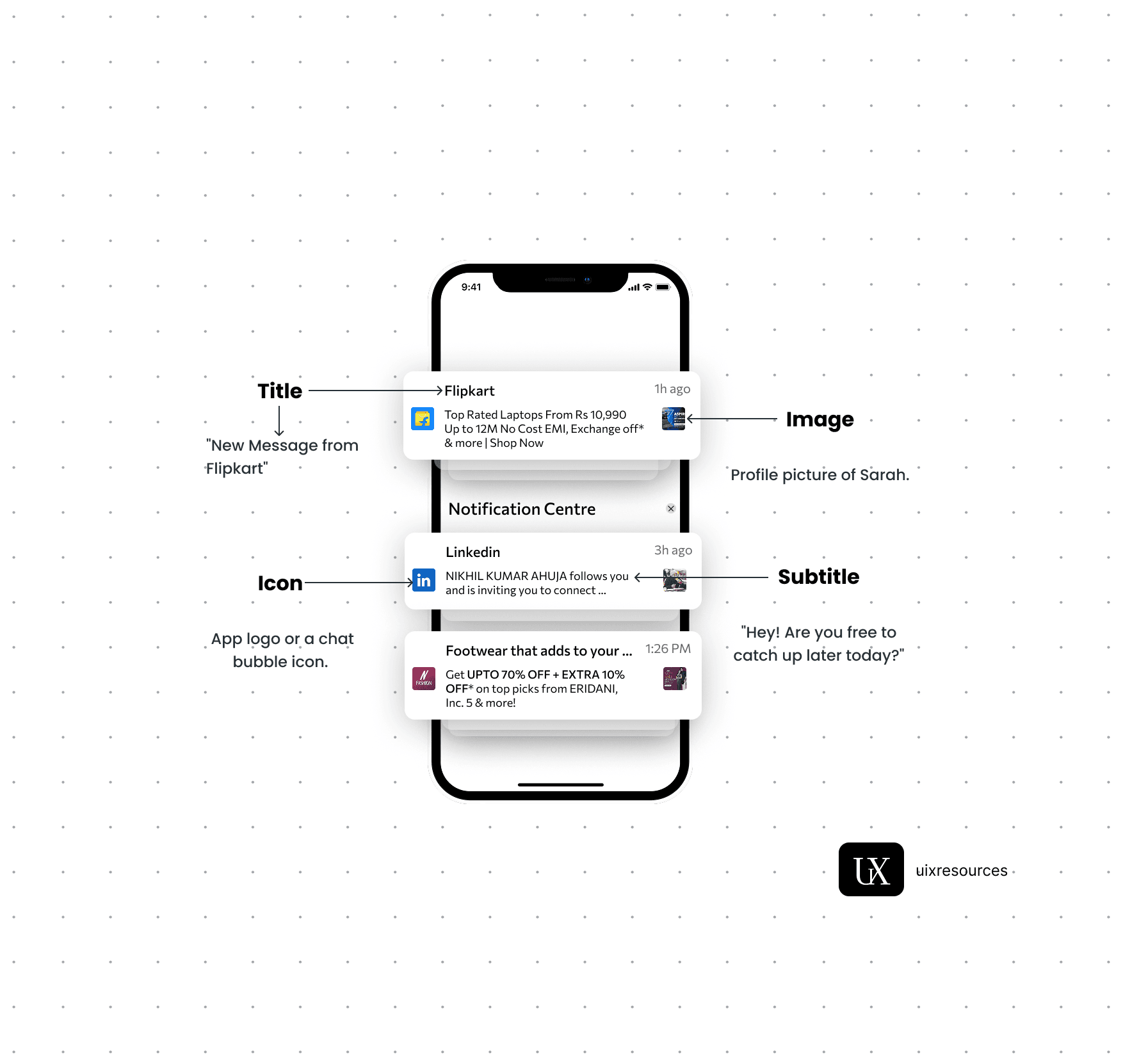
Notifications are critical components in UI design that provide users with timely information, updates, or alerts. They help keep users informed about changes, activities, or important events within an application, ensuring a responsive and engaging user experience.
Message Text:- Keep the message short, clear and to the point. It should convey the main information or call to action immediately.
Personalization:- Use the user's name or relevant personal data to make the notification feel more personal and engaging.
Actionable:- Include a clear call-to-action (CTA) that encourages user engagement, such as "Read More", "Reply" or "Shop Now"
Icons:- Use a recognizable app icon or a specific related to the notification to make it easily identifiable.
Image or Thumbnail:- Consider adding a small image or thumbnail to provide visual context and make the notification more engaging, especially for rich notifications.
Color:- Use brand colors and contrasting elements to make the notification stand out while aligning with your apps design.
Content and Clarity
Visual Elements
Content and Clarity:-
Message Text:- Keep the message short, clear and to the point. It should convey the main information or call to action immediately.
Personalization:- Use the user's name or relevant personal data to make the notification feel more personal and engaging.
Actionable:- Include a clear call-to-action (CTA) that encourages user engagement, such as "Read More", "Reply" or "Shop Now"
Creating a clean, readable, and user-friendly text layout is a core part of UI design. Poorly designed text spaces can overwhelm users, reduce engagement and make interfaces feel cluttered or unprofessional.
White space boosts clarity and focus in UI. Use 16-24px padding for text and 32px+ between sections to avoid clutter. It enhances readability and creates a clean, organized design.
Guide users with structured typography-vary sizes (H1: 32px, H2: 24px), weights (bold, semi-bold), colors. Keep line height balanced (1.4-1.6x) and hierarchy simple for easy scanning.
Use clean, web-safe fonts like Inter or Roboto for better readability. Avoid thin or decorative fonts in body text. Ensure high contrast (4.5:1 minimum) for accessibility. Simple, clear typography enhances UX.
Long lines tier the eyes and reduce focus.

White Space
Clear Visual Hierarchy
Legible Typography
Limit Line Length
Clean & Readable Text
For better UI text, use relative units (em/rem) for responsiveness. Keep content scannable with short paragraphs, bullets and headings. Ensure proper spacing (1.4-1.6x line height) and left alignment. Balance contrast and whitespace while avoiding clutter. Optimize line length (50-75 chars) and highlight key elements minimally. This improves readability and user experience.


Why Choose Us?
Expertly Designed Products
Time-Saving Solutions
Affordable Excellence
Reviews
This book explains UI/UX design in very practical and easy way. Must recommend for beginners. It will be game changer for you

Shreyansh
Amazon
Social Media