
Design Product Card
Notifications are critical components in UI design that provide users with timely information, updates, or alerts. They help keep users informed about changes, activities, or important events within an application, ensuring a responsive and engaging user experience.
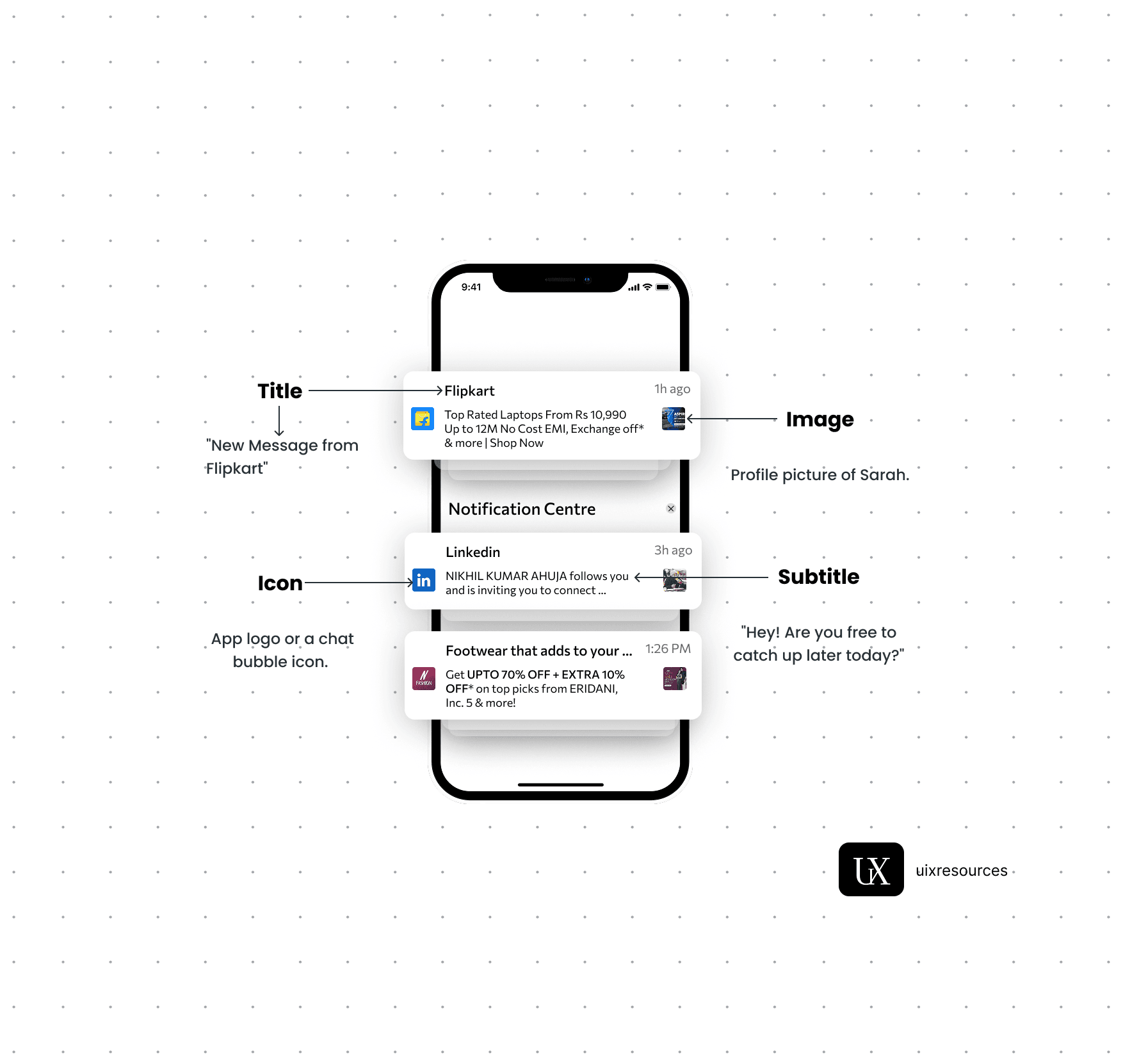
Message Text:- Keep the message short, clear and to the point. It should convey the main information or call to action immediately.
Personalization:- Use the user's name or relevant personal data to make the notification feel more personal and engaging.
Actionable:- Include a clear call-to-action (CTA) that encourages user engagement, such as "Read More", "Reply" or "Shop Now"
Icons:- Use a recognizable app icon or a specific related to the notification to make it easily identifiable.
Image or Thumbnail:- Consider adding a small image or thumbnail to provide visual context and make the notification more engaging, especially for rich notifications.
Color:- Use brand colors and contrasting elements to make the notification stand out while aligning with your apps design.
Content and Clarity
Visual Elements
Content and Clarity:-
Message Text:- Keep the message short, clear and to the point. It should convey the main information or call to action immediately.
Personalization:- Use the user's name or relevant personal data to make the notification feel more personal and engaging.
Actionable:- Include a clear call-to-action (CTA) that encourages user engagement, such as "Read More", "Reply" or "Shop Now"
A product card is a compact UI element used in e-commerce apps or websites to showcase a product at a glance. It typically includes an image, product name, price, and a way to take action (like adding to cart or favoriting). A well-designed product card balances visual appeal with functionality, making it easy for users to explore and take action quickly.
To create an effective product card, it's important to structure the information in a visually appealing and easily digestible format.
Designing a product card with strong visual hierarchy involves organizing elements to guide the viewers attention in a logical and aesthetically pleasing manner.

Layout
Visual Hierarchy
Image
Content Limit
Call to Action
Use High Quality Image:- Display a clear, high-resolution image of the product to attract attention and give customers a detailed view, enhancing their purchasing decision.
Keep only important content, which is not too long and heavy.
At the bottom, large and colorful button for easy interaction and also each action button on the screen based on its importance.
Button like “Add to Cart”, “Buy Now”, or a heart icon for “Wishlist”.
Clear, high-contrast, and preferably in the card’s lower section.
Optional: show secondary CTA on hover (e.g., "Quick View").

Why Choose Us?
Expertly Designed Products
Time-Saving Solutions
Affordable Excellence
Reviews
This book explains UI/UX design in very practical and easy way. Must recommend for beginners. It will be game changer for you

Shreyansh
Amazon
Social Media