The Blog for Designers, Thinkers, and Innovators.
uixresources . Jan 27, 2025

Dark Mode Design: Beyond Aesthetics in 2025
Dark mode has become more than just a trendy UI choice; it is now a critical element in modern digital design. With increasing user preference for dark interfaces, brands and designers must move beyond aesthetics and consider usability, accessibility, and performance. In 2025, dark mode design is evolving with new technologies, improved readability standards, and deeper personalization. This blog explores the key aspects of designing dark mode interfaces that go beyond just looking cool.
Dark mode isn’t just a fad. Major platforms like Apple, Google, and Microsoft have fully embraced it. Users prefer dark mode for its energy efficiency, reduced eye strain, and sleek appearance. However, simply inverting colors isn’t enough; dark mode should be strategically designed for enhanced user experience.
The Rise of Dark Mode
Why Dark Mode Matters?
Key Principles of Dark Mode UI/UX Design in 2025
Introduction
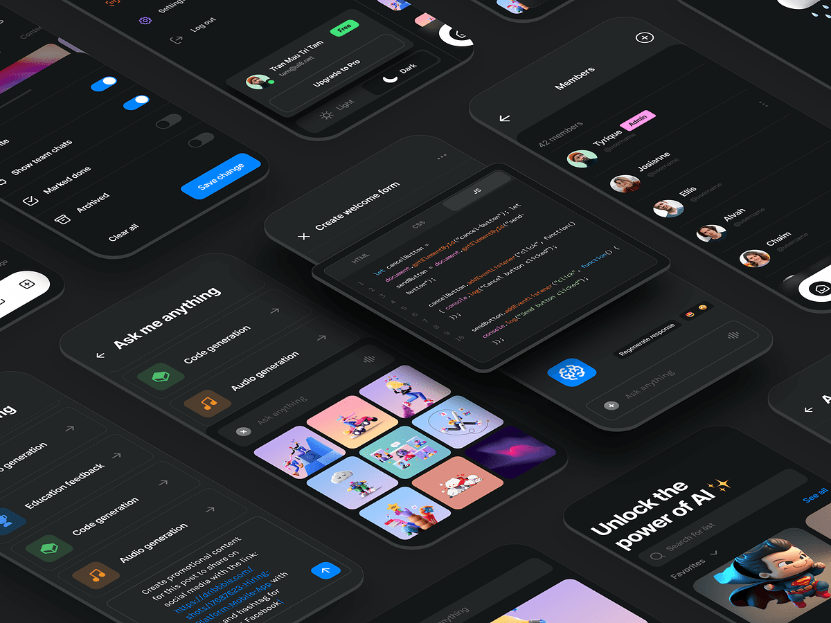
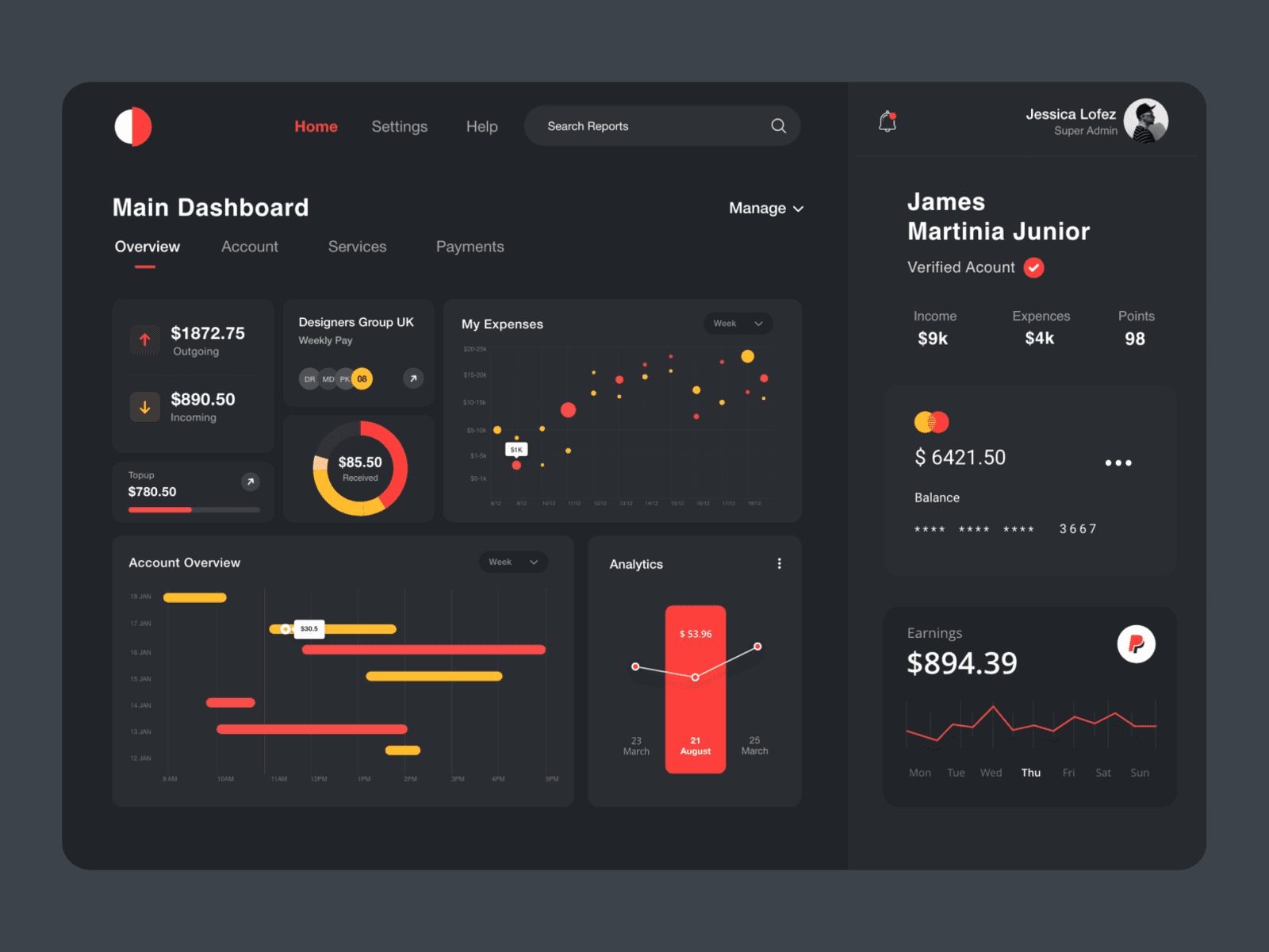
Best Practices for Implementing Dark Mode in Apps & Websites
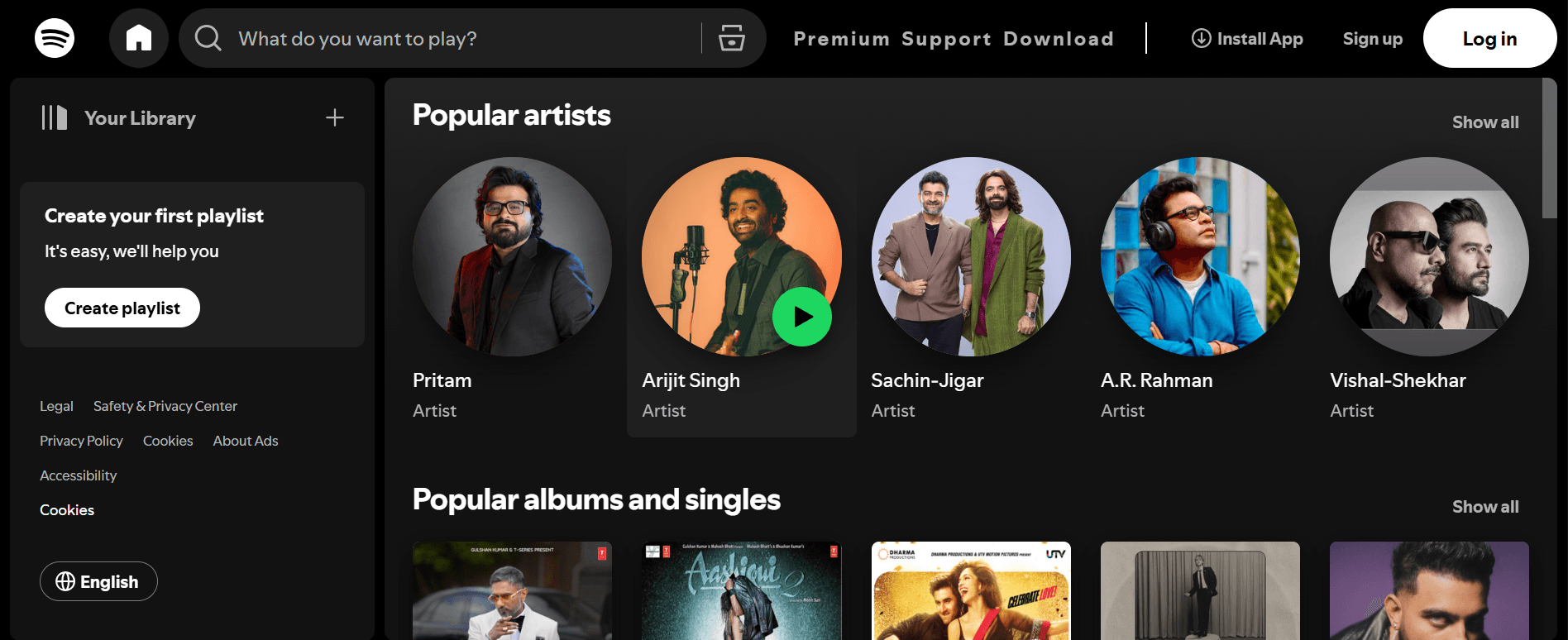
Dark Mode in Popular Apps: What We Can Learn?
Reduced Eye Strain: Less blue light exposure improves readability in low-light conditions.
Battery Efficiency: OLED and AMOLED screens consume less power with darker pixels.
Accessibility and Comfort: Helps users with light sensitivity and improves long-term readability.
Aesthetic and Emotional Impact: Darker interfaces create a premium, focused experience.
Provide a Toggle – Users should have full control to switch between light and dark modes.
Test in Different Environments – Ensure visibility in both bright and low-light conditions.
Consistency Across Devices – Align dark mode experience across mobile, web, and desktop applications.
Performance Optimization – Minimize battery consumption on OLED screens by leveraging true blacks effectively.
Spotify: Uses deep blacks and green accents for a sleek look.
YouTube: Offers a balanced dark gray background with readable white text.
Twitter/X: Provides multiple dark themes for personalized experience.
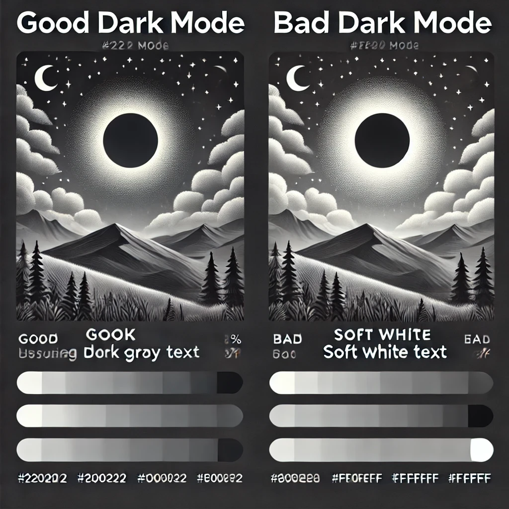
1. Smart Contrast and Readability
Dark mode isn’t just about using black backgrounds. A well-designed dark UI should have optimized contrast to ensure content remains readable without straining the eyes.
Use dark grays (#121212, #1A1A1A) instead of pure black (#000000) to reduce harsh contrast.
Ensure sufficient contrast between text and background (WCAG 2.1 AA compliance).
Avoid using pure white text (#FFFFFF) on dark backgrounds; opt for softer hues like #EAEAEA.
2. Color Adaptation for Dark Mode
Bright and saturated colors can feel overwhelming in dark mode. The solution is:-
Using muted or desaturated colors.
Adjusting accent colors to maintain vibrancy without excessive brightness.
Ensuring brand identity is preserved while adapting to dark mode.
3. Accessibility in Dark Mode
Inclusive design means considering different user needs,
Font weight adjustments to maintain legibility.
Avoiding pure black backgrounds for users with astigmatism.
Ensuring clear visual hierarchy and distinguishable interactive elements.
4. Dynamic Dark Mode with AI
2025 is seeing AI-powered dynamic dark modes that adapt to user behavior,
Auto-adjusting contrast based on ambient lighting.
Customizable dark themes allowing users to tweak darkness levels.
Smart inversion algorithms ensuring content remains visually balanced.

A well-designed dark mode enhances usability, extends device battery life, and improves accessibility. As we move forward, creating effective dark mode experiences will require thoughtful color choices, smart contrast, and AI-driven adaptability. It’s time for designers to go beyond aesthetics and make dark mode a seamless and enjoyable experience for all users.


Social Media